PHASE 1
LOGO CONCEPT DEVELOPMENT
My Digital Media Composition I classes in the Graphic Communications Management program had just finished a project on typography. Students were asked to apply what they learned in that assignment towards the Ivory Tower Branding Label Design project. I assigned the project to students from both sections of my Digital Media Composition I class. I showed them examples of design and wine label samples. They learned about identity systems and basic design principles, such as shape, form, texture, balance, and eye path. Students were asked to present and discuss a sketch of their logo concept with me.
I used the following resources:
Wine Label Design Guide and 50 examples of Eye-catching Wine Label Designs.
Fundamentals of Graphic Design video
Previous wine label designs (We discussed what worked and didn’t work on previous wine label designs for the Ivory Tower wine label.)
7 different types of logos (showed some examples of each type)
Abstract: The Art of Design Paula Scher video clips on identity systems (Netflix)
Shakespeare in the Park identity system article (Pentagram)
Peace/Gace logo identity system Illustrator project (Personal)
Demonstration on how to create vector graphics in Adobe InDesign
Demonstration on how to create custom color swatches in Adobe InDesign Demonstration on how to create vector graphics in Adobe Illustrator
Demonstration on how to set up a wine label document comp in Adobe InDesign
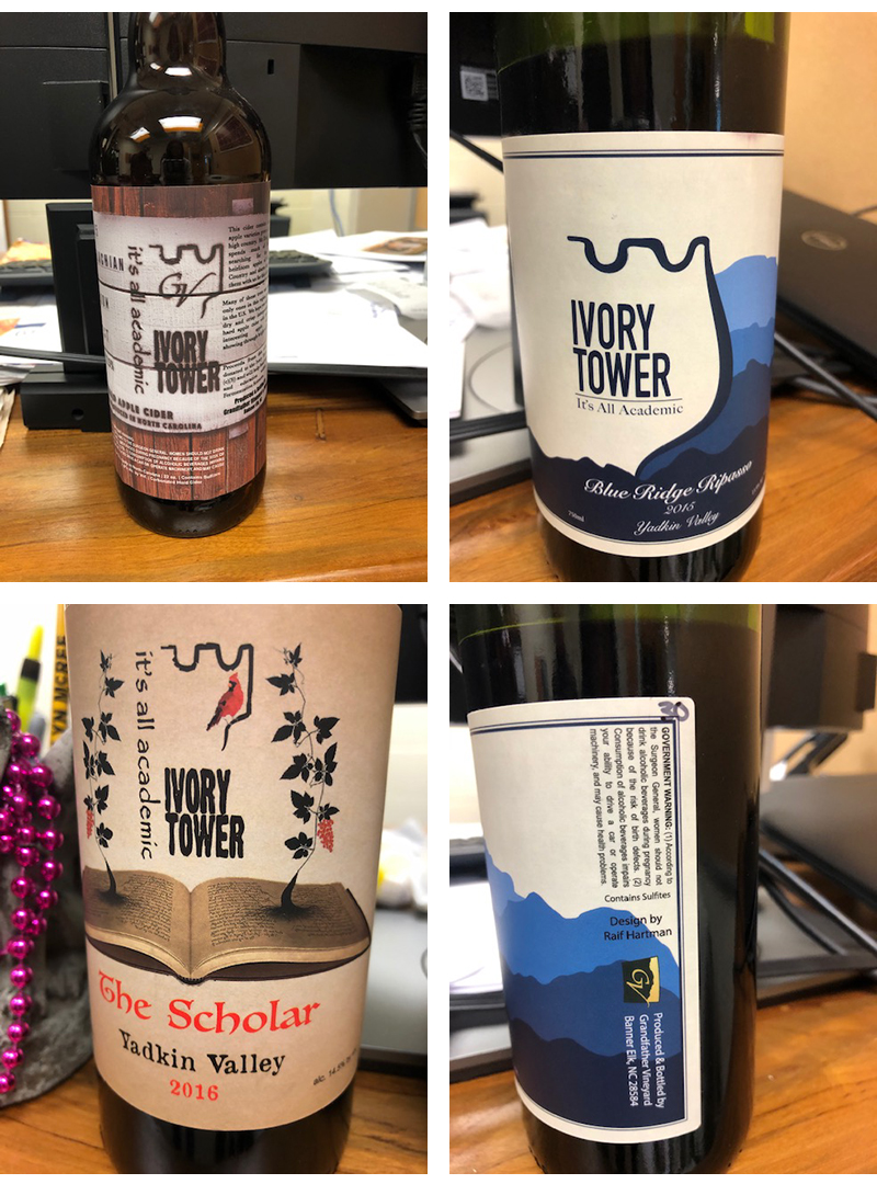
See some previous Ivory Tower wine bottle labels (left or above).