PHASE 4
FINAL DESIGN REVISIONS
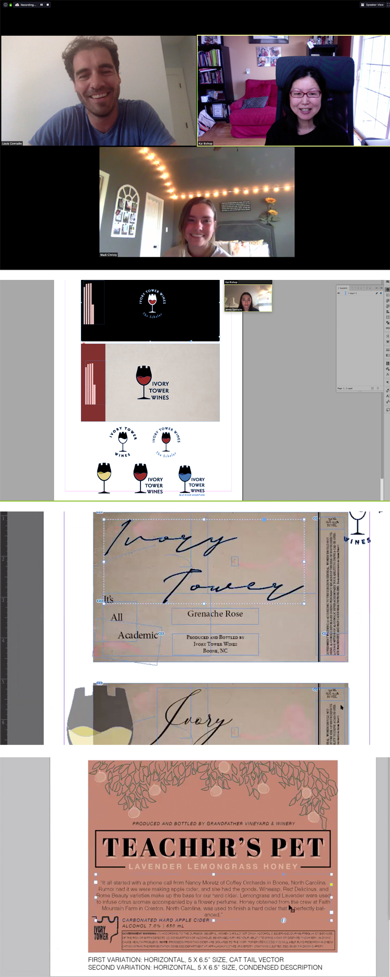
I met with Louis in Zoom on April 8 to discuss feedback from the department of Fermentation Sciences. Louis communicated that others in the department of Fermentation Sciences liked the current wine label designs that they already had, so we needed to find a way to incorporate elements from the previous design into the student revisions. During the meeting, we narrowed the selection down to a single student design for the Cider label, and we decided to combine two student designs for the Wine labels. Two students were from section 102, and the other one was in section 101.
Watch the video recording with Louis here as we discussed the Cider design:
Watch this video recording with me and student Madi Christy as I shared feedback from Louis about her Cider design:
Louis and I met with student designer Madi Christy on April 13, to review her revised logo designs for Ivory Tower’s Cider product. I offered some suggestions, and we discussed what the process would look like moving forward.
The following changes were requested for the Cider Product:
1. Change the product logo name to “Teacher’s Pet”
2. Add the previous Ivory Tower logo as the Parent brand logo (I added a sample for reference: “Booneshine Space Pegasus”)
3. Add the slogan “It’s All Academic”
4. Add a paragraph description about the product (provided by Louis)
5. Change the background color to an apple peel image or golden yellow texture
6. Change the color of the leaves to green, change the color of the apples to Winesap red tones
7. Refer to the previous label sample for legal requirements
8. Combine the cider names into a single product name: Lavender, Lemongrass, Honey Cider
9. Reduce the size of the carbonated hard cider, alcohol content, and Grandfather Vineyard texts
Louis and I also discussed the Ivory Tower logo design for the wine products. Watch this video recording of that meeting:
I met individually in Zoom with the other two student designers, Josh Buwick and Jenna Sparacio, about the Wine label designs. I showed them some examples from Louis Conradie and asked them to combine the background from Josh’s design with the tower element in Jenna’s logo. Below were the requests for the Wine label design.
Ivory Tower Wine Products:
1. Combine elements from Josh’s comp and Jenna’s logo
2. Use the background stain image from Josh
3. Make the logo refer more to the previous Ivory Tower logo
4. Refer to the comps from Louis for typographic style, colors, and composition
5. Add the slogan “It’s All Academic”
The screenshots were taken from several Zoom meetings with Louis Conradie and the student designers.
Amanda's final design for "The Scholar" incorporates the regional Appalachian mountains and state bird of North Carolina, the cardinal, in the logo. Conradie had expressed a desire to connect to the region since the wines were produced, bottled and sold locally. Since he also wanted a unified design that would work across all varieties of products within the wine family of "The Scholar" brand, Amanda used a ribbon across each label with color variations for each product. She chose modern, sans serif fonts throughout. To learn more about the design and print process, see the Phoenix Challenge book designed by Jennifer Pantoja-Paredes here.