Active Faulting in the Western Transverse Ranges, CA
Mechanical Earthquake Cycle Models of the Ventura Basin
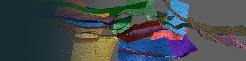
Along with my collaborators, Michele Cooke (UMass), Gareth Funning (UC Riverside), and Susan Owen (Jet Propulsion Lab), we have created 3D mechanical models of active tectonics in the complex western Transverse Ranges of southern California. These models use non-planar, geologically representative fault surfaces based on the Community Fault Model, compiled by the Southern California Earthquake Center. So far, we have compared results from these models to fault slip distributions, but more papers are on the way. I am also interested in using physics-based models, to better understand the effects of the 18 km thick Ventura sedimentary basin (low elastic stiffness) on regional fault behavior and deformation patterns.
The images below show some of our results...
Regional Fault Structure of the Greater Ventura Basin Region
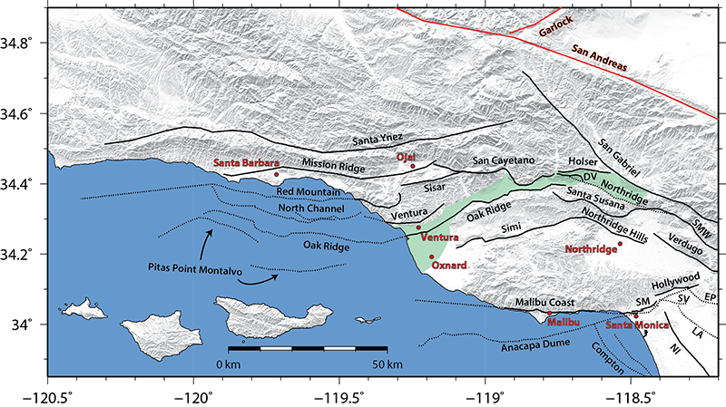
Above: Location map, fault traces, and shaded digital elevation model of the western Transverse Ranges region. Note the complexity of the fault network. Selected cities are labeled with red circles and text, and a generalized outline of the surface expression of the Ventura Basin is highlighted in green. The Santa Barbara Channel is the region between the Channel Islands and the coast near Santa Barbara. Fault traces included in numerical models are shown with black lines (dotted when offshore or blind) and are based on the Southern California Earthquake Center (SCEC) Community Fault Model (CFM) version 4.0. The San Andreas and Garlock faults are not included in the numerical models but are shown with red lines for reference. Fault abbreviations are as follows: DV, Del Valle; EP, Elysian Park; LA, Los Angeles segment of the Puente Hills thrust; NI, Newport-Inglewood; SM, Santa Monica; SMW, Sierra Madre West; SV, San Vicente. Several faults from the nearby Los Angeles basin (to the southeast) are included in the numerical models in order to properly account for any potential mechanical interactions between these structures. For a complete three-dimensional and interactive version of the modeled fault mesh, click here or visit my 3D Interactive Fault Models page.
Average Fault Slip Rates of Faults in Western Transverse Ranges
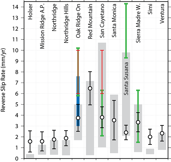
Above: Comparison of model-calculated average slip rates (black circles) to geologic (gray rectangles) block model (green: Meade and Hager (2005); blue: Loveless and Meade (2011)), and two-dimensional models (red: Donnellan et al. (1993) and Hager et al. (1999)) slip rate estimates. Because modeled fault surfaces have spatially-variable slip rates, error bars on the model calculated slip rates show the 1σ range in slip across the entire fault surface. Note that some outlier model-based predictions are not plotted. For example, several existing block model predictions for the Santa Monica and Santa Ynzez fault suggest ongoing normal slip which is inconsistent with abundant geologic evidence for reverse slip. Furthermore, some existing models simplify the western Transverse Ranges into a single fault, thus a comparison is not meaningful. In the end, the 3D mechanical model provides an improved fit the geologic slip rate ranges compared to previous block and two-dimensional models.
Distribution of Fault Slip Rates at Earth's Surface
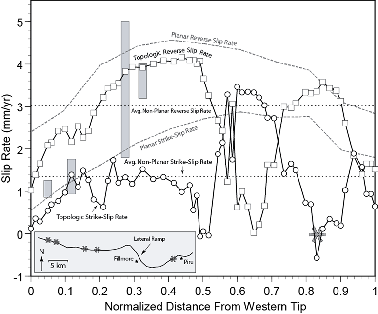
Above: Model-predicted reverse-slip distributions at the surface of the Earth along the San Cayetano fault. The inset shows the surface trace geometry (refer to the map above for location) and the approximate locations of existing geologic slip rate estimates. Solid black with squares (reverse slip) and circles (left-lateral strike-slip) lines show nonplanar (CFM-based) model results while planar model results are presented with gray dashed lines. Paleoseismic slip rate estimates are shown at the location of study (gray rectangular ranges). Dolan and Rockwell (2001) found no evidence of lateral slip at location ≈ 0.83 (large asterisk), which coincides with very slow strike-slip rates predicted by the non-planar model. Note that the non-planar models agree much better with the geologic data compared models with planar faults.
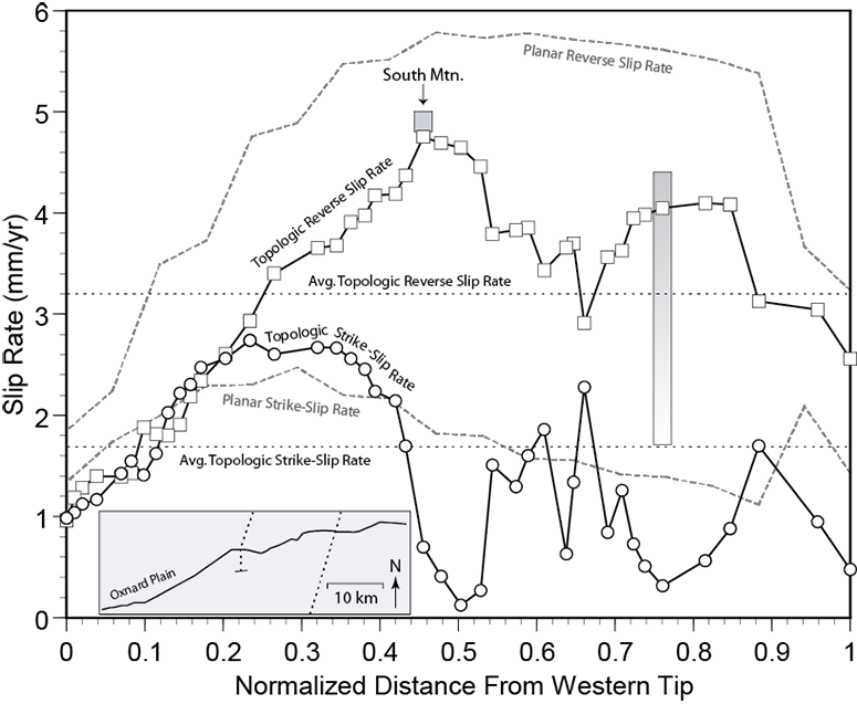
Above: Near surface fault slip distribution along the onshore portion of the Oak Ridge fault. Labeled features follow from the previous figure above. The location of South Mountain, indicated on the plot, has the fastest reverse slip rate of the entire near surface of the modeled fault, but the model results suggest that this is the fastest slipping portion of the entire fault surface. This implies that the seismic hazard for this fault was previously overestimated.
3D Distribution of Fault Slip Rates
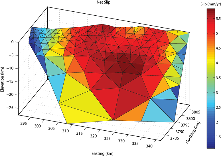
Above: The three-dimensional distribution of net slip on the onshore segment of the Oak Ridge fault. While the slip rate distribution plots above highlight some of the near-surface complexity in slip behavior, the actual model-predicted 3D distribution of slip reveals even greater complexity. As is expected, the maximum net slip rates occur near the center of the fault surface near the surface of the Earth. This doesn't tell the whole story though. See the distribution of dip slip and strike-slip plots below.
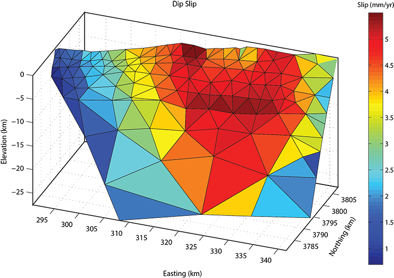
Above: The three-dimensional distribution of reverse slip on the onshore segment of the Oak Ridge fault. Note that the vast majority of reverse slip is predicted to occur in the eastern half of the fault. This is consistent with the topographic expression of the Oak Ridge dying out to the west.
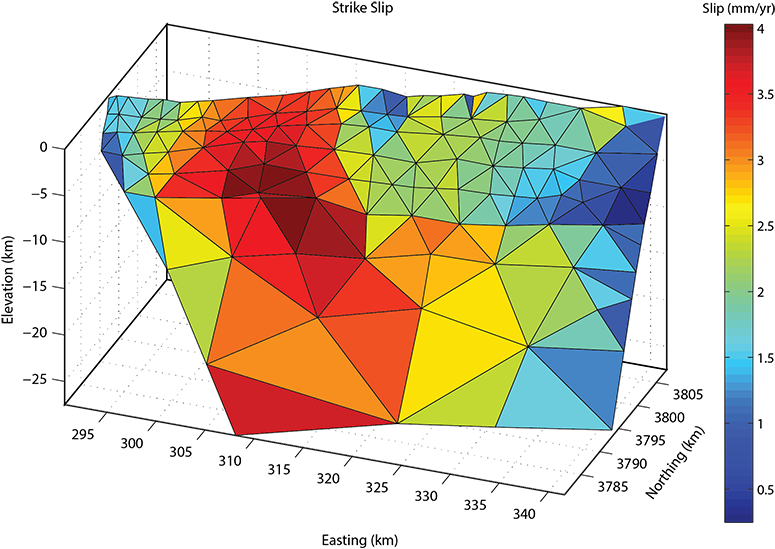
Above: The three-dimensional distribution of strike-slip (left slip is positive) on the onshore segment of the Oak Ridge fault. Yeats (1988) hypothesized that the Oak Ridge fault becomes a left-lateral strike-slip fault in its western half, and indeed, the mechanical model predicts the vast majority of left-slip to occur in the western half of the fault.
Comparison to Interseismic GPS Data
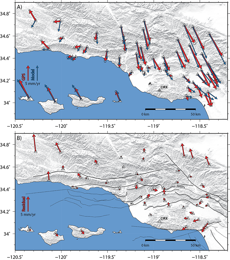
Above: A) Comparison of corrected interseismic GPS velocities (red arrows) to predictions from the 3D mechanical model
with a best-fitting 13 km locking depth (blue vectors). All velocities are shown relative to GPS site CIRX.
B) GPS-model residuals for the same 13 km locking depth model. Fault traces are shown with black sinuous lines that are dotted where blind or offshore.
Note that in general, the model reproduces the GPS velocities well, with largest areas of misfit occurring near the edges of the region
to the northwest, northeast, and southeast. The model does not produce sufficiently fast velocity gradients across the Ventura Basin,
a result that is expected because the model does not incorporate low rigidity sediments in the Ventura basin (e.g. Hager et al. 1999).